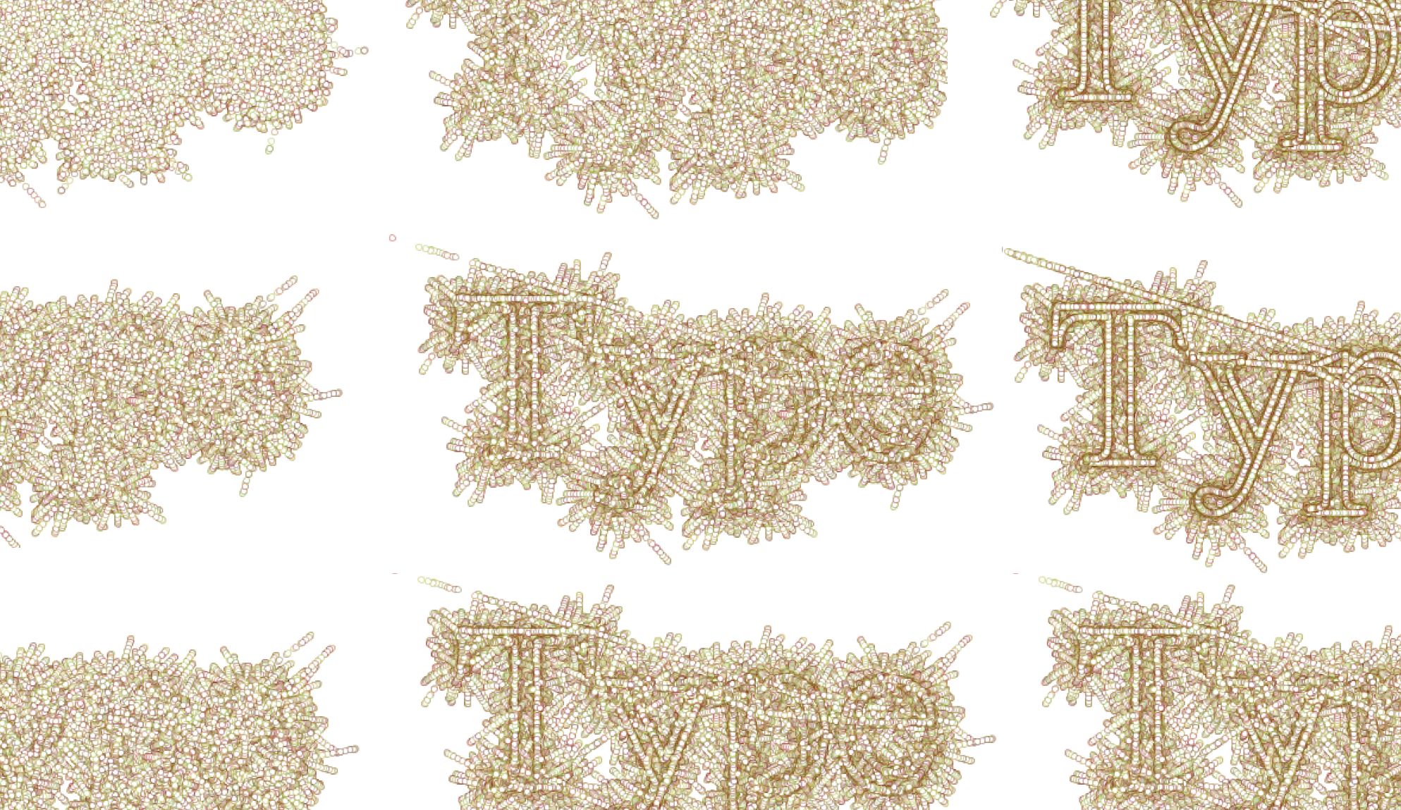
Maneo (latin for remain, await or wait) is a printed report of visual experiences based on an algorithm that was applied to typography. The sketch was made to explore firstly the wider possibilities in typography made possible through computational arts and secondly the dynamics of expectation (letters) and unexpectation (particles). It was created using the Processing language and consists of various parameters that handle the visual output of the sketch. Letter forms are dissolved into a multitude of points which can be replaced with any shape and be animated, thus inviting the audience to take part in what looks like an artistic journey into the microscopic world. The chosen format of the project is not coincidental. Having a background in graphic design with typography as a speciality, I wanted this project to be consistent with the way typographers work instead of wanting to get a purely digital outcome. Although type designers and typographers use computers much nowadays, the look of the final product on a printed surface will always affect their decision making at the end. I wanted the project to stick to the practice of typography by using a traditional format to display the results of the experiment.

Renato Correa de Sampaio is a French-Brazilian designer who’s previously studied graphic design in UCA. His work ranges from brand identity to liberal arts. Putting emphasis on typography, he uses computational means to bring design solutions, trying to had a poetic dimension to his work. He has worked with different individual artists and companies on their branding process and looks forward to continue working in the field of graphic design and extend his practice in other areas of computation arts.
